Wayfair Quickview Redesign
Wayfair was a corporate sponsor for one of my graduate UX courses at Bentley University. The ask from Wayfair was to redesign the quickview feature on their website and improve online shoppers experience. View project slide deck
Project Overview
CHALLENGE: How might we create a product experience that allows shoppers to see more details about a product, easily shortlist or compare products, and checkout faster?
SOLUTION: Improve readability of Quickview by altering the layout, allowed users to shortlist by being able to minimize the quickview, and allowed users to customize products, as well as express checkout.
CLIENT: Wayfair
TEAM: 2 graduate design students
TIMELINE: 6 weeks
Current Design
Key findings
Photos, Prices, Dimensions, Reviews, Delivery Times and sometimes Material are key considerations in the purchase journey.
Clarity on the purpose of the Quickview is key (The business intent must be clear to the user so he or she can decide whether or not to use it as a tool when shopping)
Too much of information on the Quickview making it hard for users to differentiate its use from Product Details Page.
Discoverability of Quickview was an issue.
Too similar to details page
Wayfair’s current Quickview Design
“I think I will use Quickview when I am half sold on something... As a means to see more images or to shortlist.”
SWOT Analysis
Competitive Analysis
Key Takeaways:
WayFair’s Quickview has all the information its product details has, except for an ‘at a glance’ section, which is the expected purpose of a Quickview.
Intent for Quickview in reviewed competitors are clearer: photos, product summarization, quick purchase, customization.
Wayfair intent for user is unclear from the design, however we understand that for business, there is value for SEO purposes.
Personas
Journey Maps
Journey Map by shopper type
Business goals
We interviewed our stakeholder to understand any frustrations from his perspective and what his business goals were. We identified 2 main business goals that could be incorporated into our redesign.
SEO
The purpose from a business standpoint is search engine optimization.
INCREASE REVENUE
Decreasing friction in the purchase journey correlates to an increase in revenue
User goals
Based on our research and stakeholder interview, we created a UX strategy to meet the stakeholder's business goals using human-centered design.
1. FASTER CHECKOUT
Make it easy to add to cart and/or checkout
2. SHORTLIST/COMPARE PRODUCTS
Make it easy to comparison shop or shop complimentary items
3. SEE PRODUCT DETAILS
Enable customization and product previews
Wireframes
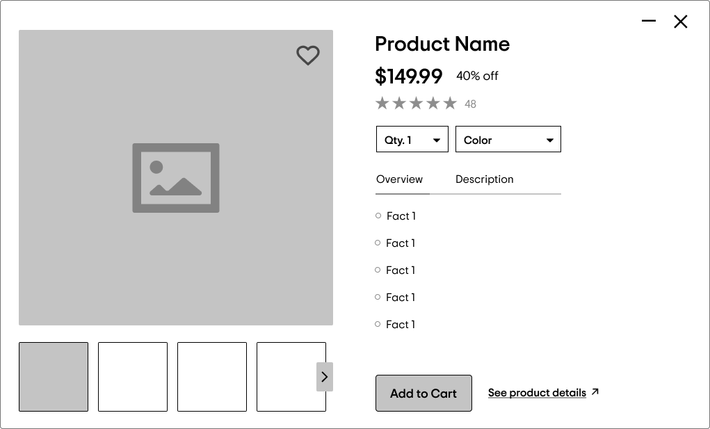
Recommended Redesign
Key Design Features
Product at a glance
Express Checkout
Choice of colors
A clean visual hierarchy
Ability to minimize
Visual Mockups
Click here to see live demo
Summary
Distinct differentiation between product details page and Quickview
Leverage opportunity to enable quick decision making by providing just enough product information
Enable faster conversions by allowing the value seeker archetypes to express checkout, helping them complete their purchases without going through multiple clicks
Clear visual hierarchy and use of white space will improve readability and attention to key information
Ability to minimize Quickview windows to enable product comparison and inspire decision making


